
Leggerezza e stile
Leggerezza e naturalità si incontrano in una piuma.
Lightness and naturalness meet in a feather.
brief / output
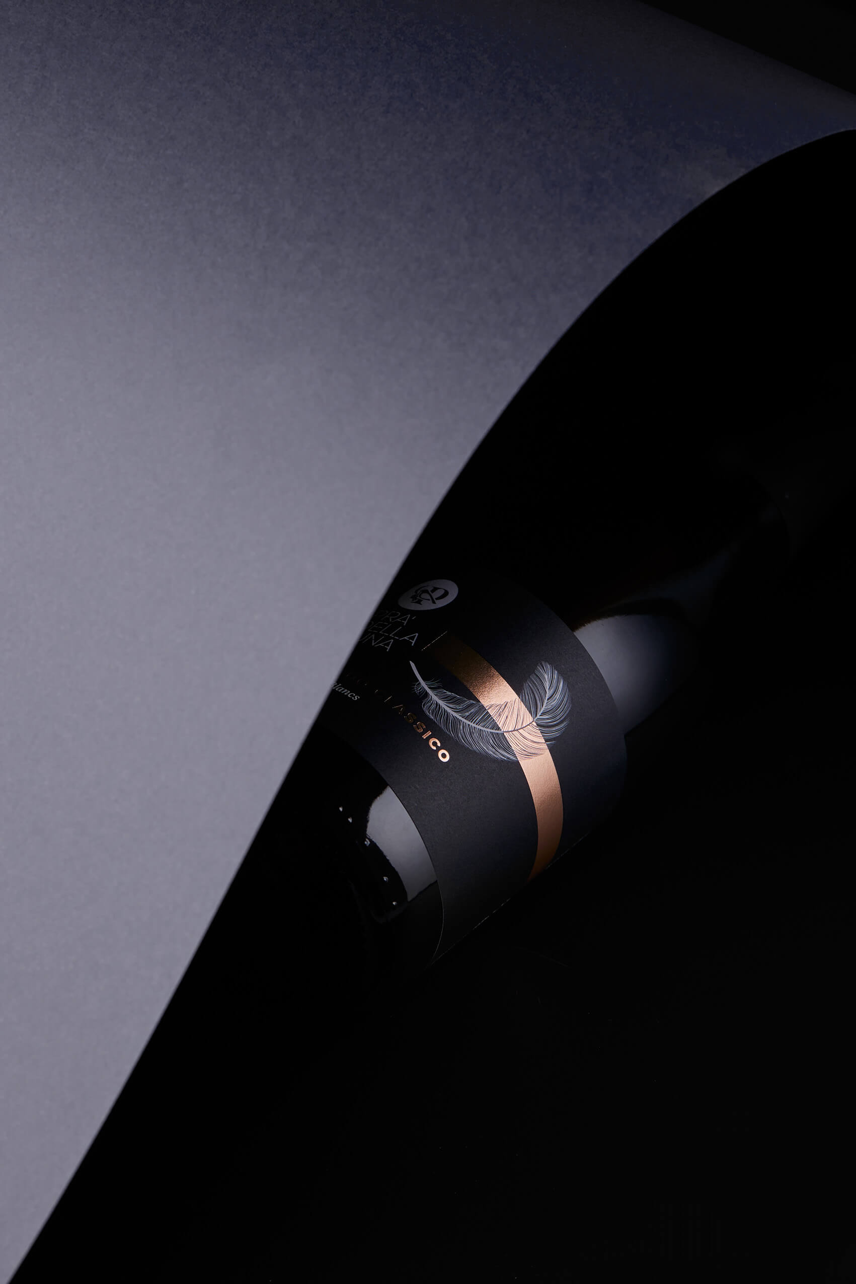
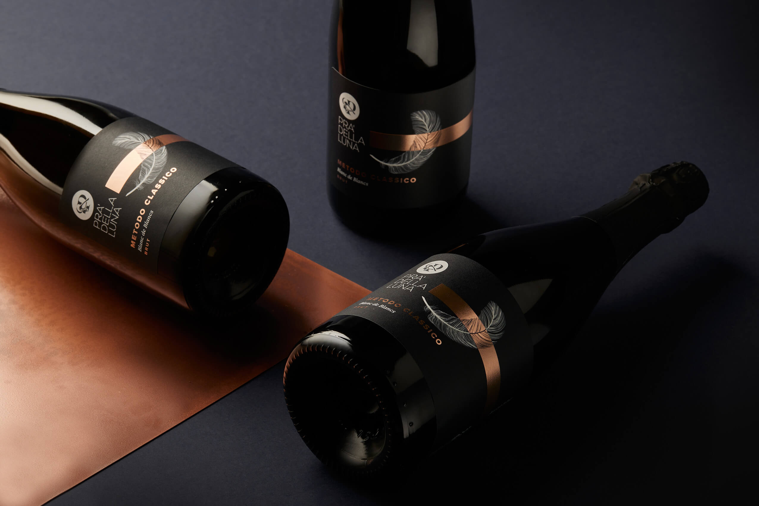
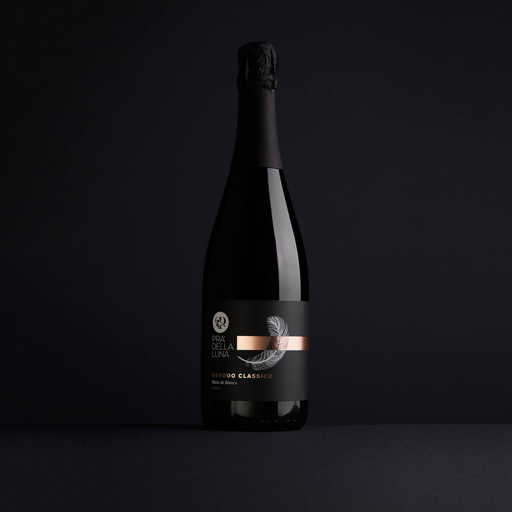
Per questa etichetta Pra’ della Luna abbiamo puntato a un design moderno, in linea con le attuali tendenze e coerente con la linea principale.
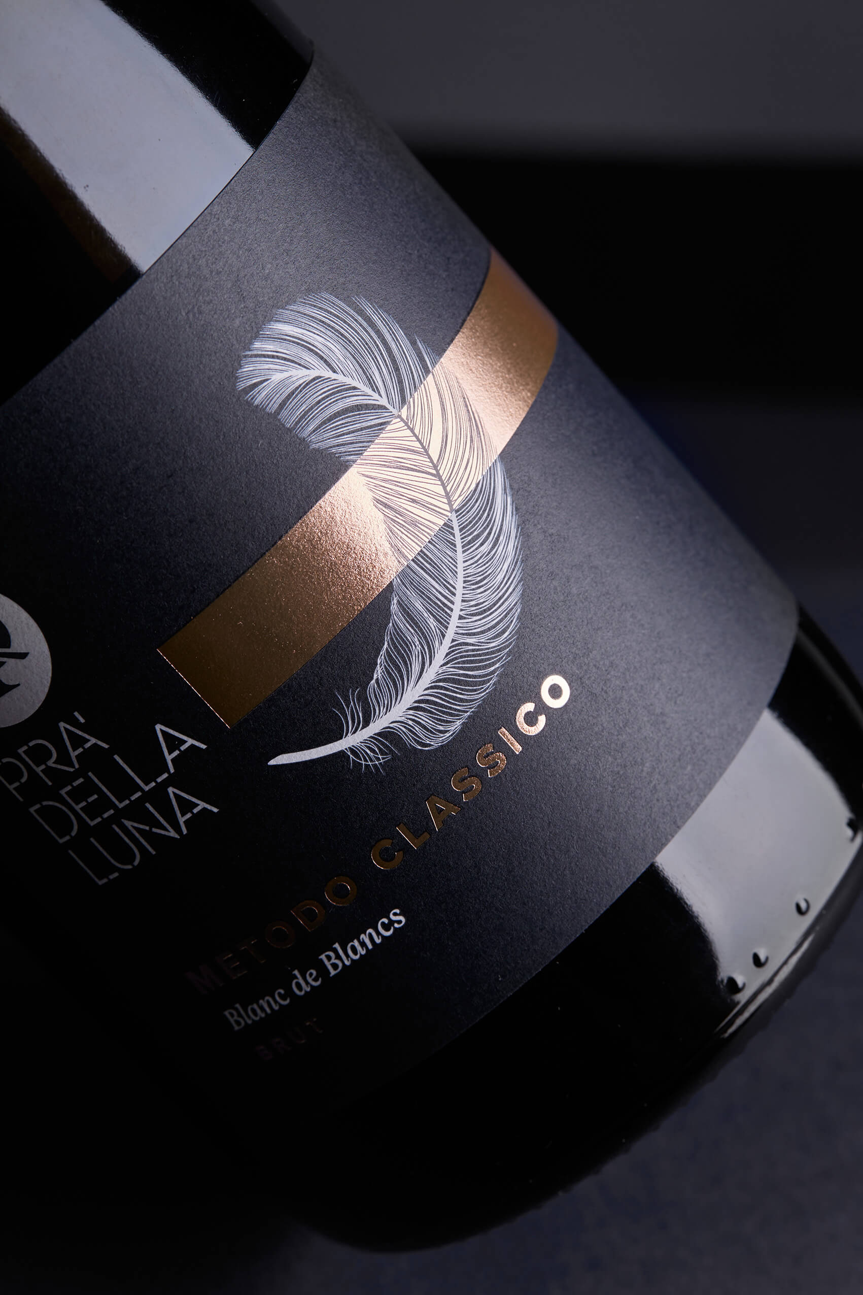
La piuma richiama il logo, la leggerezza e la naturalità del Metodo Classico, mentre il colore bronzo dialoga con la torbidità del lievito e crea un legame visivo con le altre referenze premium.
L’obiettivo era valorizzare il prodotto, allineandolo alla famiglia Black Label, rendendo l’etichetta riconoscibile, elegante e contemporanea.
For this Pra’ della Luna label, we focused on a modern design, in line with current trends and consistent with the main line.
The feather references the logo, the lightness, and the naturalness of the Classic Method, while the bronze color interacts with the yeast cloudiness and creates a visual link to the other premium SKUs.
The goal was to enhance the product, aligning it with the Black Label family and making the label recognizable, refined, and contemporary.
target
HO.RE.CA – On Trade
Etichetta per Metodo Classico Friuli
La progettazione di questa etichetta è stata realizzata da Granzotto Mazzer, Studio di Packaging in provincia di Treviso attivo tra Veneto e Friuli Venezia Giulia.
Gli scatti di questo packaging sono opera del fotografo Christian Bazzo.